London Trip 5th - 7th December 2016
Whilst on the research trip to London in December I visited several galleries and show spaces as well as the artists' studio, Keelergordon. On the visits I was repeatedly struck by the ingenuity of many designers and makers working at the moment, keen to get to the root of complex, global issues, whilst portraying this in a relatively cheerful and accessible manner. Much of the design I encountered was characterised by vibrant colour and bold shapes - perhaps an attempt to decode confusing questions by reducing them to basic and familiar elements. As well as this I noted a focus on quality design and natural influences.

One of my favourite visits on the trip was to the Design Museum in Kensington. I had been desperate to check out the space ever since its recent revamp and move to the site of the old Commonwealth Institute. It's worth visiting just for the building itself, let alone any of the exhibitions, with its oak-panelled walls and concrete contours, the space feels futuristic yet comfortable and seems to radiate a sense of calm and poise.

The exhibition, Love and Fear, at the Design Museum was thought-provoking and slightly sinister. It explored the exponential rise in the use of technology around the world, from dating sites, to death masks which had been 3D printed and suggested an army of alien creatures. It was every bit as unsettling as it sounds, but all the better for it, and I left with a sense of optimism about the potential of technology, if harnessed effectively, rather than its drawbacks.
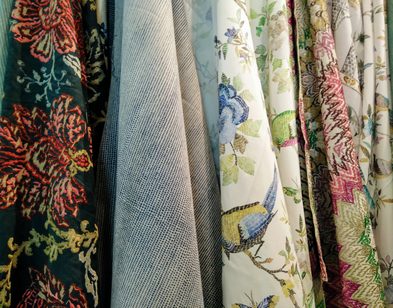
This image shows a selection of fabric samples from the GP&J Baker Showroom at the Chelsea Harbour Design Centre. It was fascinating to see such a vast array of opulent textiles, created with meticulous attention to detail and a real deference to historical influences. While floral designs were prominent, it was reassuring to find that there are always new ways to interpret botanical themes without them becoming ubiquitous.

The Tate Modern had some really interesting exhibitions, particularly in the recently added Switch House, which boasts a fantastic view across the city. This photo shows a piece called, Ink Splash (2012) by El Anatsui. It was created by weaving flattened bottle tops together using copper wire, to give the effect of brush stokes. I thought this was a fascinating way of creating colour and movement in the piece because it showed that even the most unlikely, everyday items can be incorporated into art.

I was instantly drawn to this sculpture by Phyllida Barlow, also at the Tate. I was naturally exited by the colours and distinct shapes, but loved the fact that it is deceptive in many ways. The blocks that support it look like concrete but are in fact made of wood with a coating of cement. The sculpture is called, untitled: upturned house, 2 (2012), and I think its abstract nature really allows the viewer to make their own decision about what it represents. I also love the way that it appears to be made from very sturdy materials, but also seems as though it might topple over at any moment, suggesting fragility and robustness at the same time.

Comments
Post a Comment