This week I focused mainly on Bruntwood, leaving Project 2:
Colour and Combinations to the side for a week or so. This was due to the fact
that the pitches for the Bruntwood brief are on the 6th December, so
I wanted to make sure I had as much time as possible to work through my ideas.
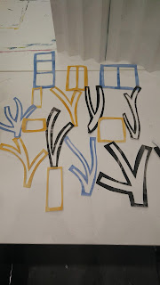 |
| Experimenting with hanging the shapes in paper. |
After working mainly in my sketchbook the previous week, I continued
to work with paper but pushed this larger scale. Working in cardboard and paper
I created bigger shapes of windows and tree branches which I could then attach and
visualise as hanging installations. These worked reasonably well, to see how
the idea would work, but I found it hard to develop as I hadn’t worked out a
proper scale and was simply going bigger. I realised towards the end of the
week that to do this effectively, I needed to measure out the size of the window
in Uni, so I could then work out the size the pieces needed to be, and how much
material I would need so I could cost it effectively. This proved difficult, as
I have never had experience of working to a specific brief before. Once I had
measured out the space, I decided to divide it into squares, to make costing
easier, and then made more shapes out of paper at this scale. I chose to make a
strip of alternating branch and window shapes. However, when I hung them up, I felt
they looked too regimented, and needed to be more organic. This was tricky to
address, as I wanted to keep within the framework I had devised to make the
budgeting process easier, but I knew artistically that I needed to allow the
shapes to flow more. I will continue to work on this over the next week in
anticipation of the pitch.
 |
Sketchbook pages.
|
 |
| Measuring the space. |
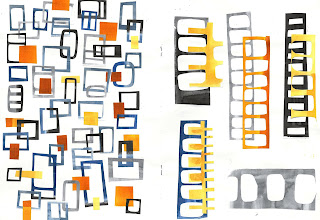
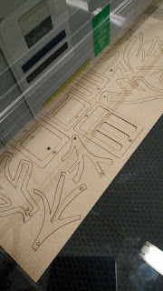
Also this week I had some of the shapes drawn from my
primary visual research laser cut. These were again, the tree and window
shapes. I had them cut small scale, just as maquettes for the real thing, and
to make dyeing the Perspex easier, but I feel this was a mistake. When strung
together they look more like decorations than an installation for a corporate
setting. However, they have been useful in showing how I need to develop my
ideas further. For example, when hanging them and photographing them in a
window space, I realised they looked good when the shapes overlapped giving
varying colour and shape effects. This I plan to emulate on a larger scale by
having fewer shapes laser cut but layering them up when they are hung. My original
idea was to have the shapes connected like chainmail, but I think they might
look more natural if allowed to move and flow together. I also feel the Perspex
shapes work better than the wooden ones, because they interact more with the
light and each other. I plan to resolve this by having fewer wooden shapes by making
them more twig-like and less blocky.
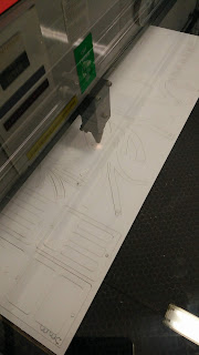 |
| Laser cutting wood and perspex. |
When dyeing the Perspex, the
orange shade came out far too dark so this week I will continue to experiment
dyeing the Perspex to get more of a warm yellow glow than a dense orange. When dyeing the perspex, I used dysperse dye and dyed for approximately 45 minutes. I may
also try painting the wooden shapes, as I feel the flatness of the mdf also
detracts from the organic feel of the pieces. I photographed the pieces in a window to see what they might look like in situ and on a larger scale, and despite the colour and size of the pieces I feel like the photos show how the shapes could look larger and layered up.
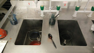 |
| Dyeing the perspex. |
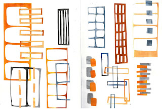
In terms of fixing the
installation into the space, I imagine them being hung from hooks in the
ceiling, and envisage the shapes being connected to one-another either with monofilament
to looks as though they are suspended in the air, or with metal rings to
emulate the surrounding industrial feel.
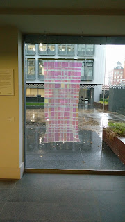 |
| The space and hangings. |


Comments
Post a Comment