Galt Exhibition, Manchester Central Library
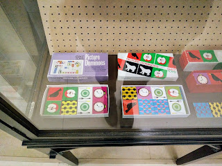
When I heard that there was an exhibition of Galt toys at the Manchester Central Library I knew I had to go and check it out. Thanks to my Mum, I grew up with Galt toys, some passed down, others snapped up from frequent charity shop trawls, and the graphic, energetic design of them has hugely influenced my preference for bold colours and quirky, cheerful imagery. It was really interesting to see such a wide-ranging (but by no means comprehensive) collection of Galt's children's toys from the 50s, 60s and 70s. Designers such as Ken Garland who designed Galt's graphic identity, and Patrick Rylands who freelanced with the company producing some of its most iconic products, have really inspired my work, from confidence in using bright colours to using strong lines to create geometric yet organic shapes.
 |
| Picture Dominoes, one of Galt's most popular toy designs. |
Seeing familiar games such as Fizzog and Connect on display reminded me of how I never considered them to be old-fashioned when I played with them as a child, which is a testament to the endurance of the designs, highlighting their timelessness. What I think is most fascinating about the toys is the way that they are so simple, yet provide a catalyst for imaginative play, through their stimulating colours, gentle shapes and tactile materials, such as smooth wood and plastic. In many ways, Galt were pioneers of the resistance to increasing technology in children's lives, and always championed play over the constant desire for children to learn, as they considered playing to be the most effective way of exploring the world.
 |
| Another example of clever use of shape and colour. |
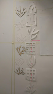
On display were also several catalogues and posters for the brand which were really simple but engaging due to their use of bright colours like pink and blue and funky, nature inspired illustrations. It struck me that rather than being bombarded by pictures and text, like so many adverts these days, the most effective ones are actually those which leave more to the imagination and require you to investigate further.
 |
| I was really cheered to see these games which I remember fondly. |
I would highly recommend this carefully curated collection of some of the most iconic mid-century design to anyone with even the slightest interest in art or design. It masterfully encapsulates a sense of excitement and joy in just a few lines and a limited colour palette - a really buoyant example of 'less is more'.
 |
| More games, puzzles and the striking adverts. |


Thanks for your kind words, glad you enjoyed it!
ReplyDeleteI really enjoyed reading this. It made the exhibition sound very worthwhile and well-presented. I wish I could have seen it myself - as I'm a great admirer of the
ReplyDeleteGalt company - but seeing your post is a good substitute! Thanks for the acknowledgement x